I wanted to design something that would help people understand the project and what I am building. A chronicle felt like an almost formal word, which led me to the idea of a scroll. Though initially pleasing to the eye, particularly the roll of remaining paper it didn’t quite fit.
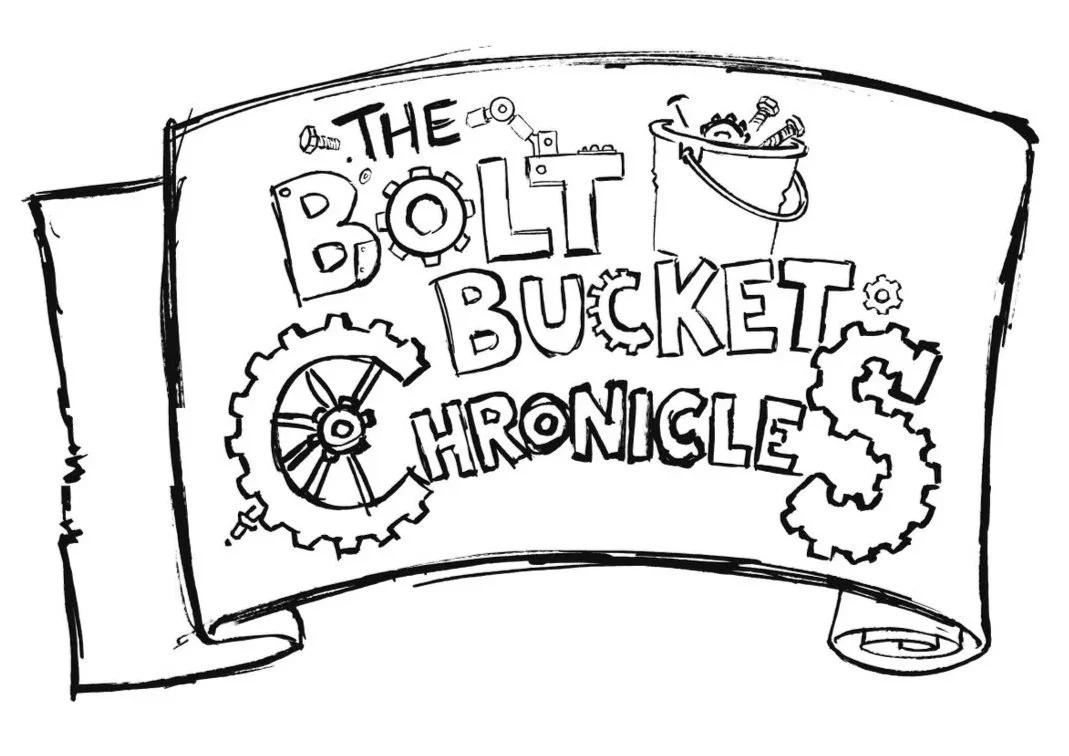
I let the idea of this being a diary or notes telling the story of the robots dictate the direction of the large logo. My brother said a metal sign or something else metallic would work better so I returned to the iPad!
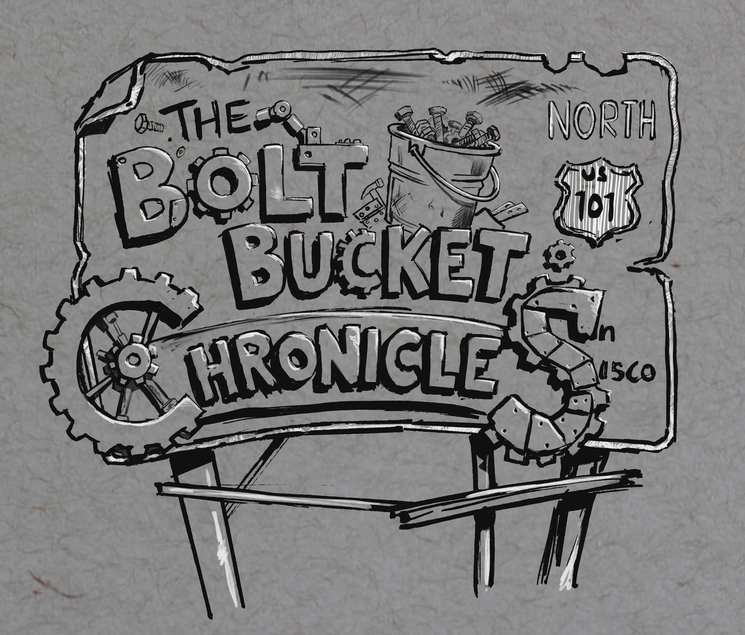
Then came the idea of a human sign, one for the real location of San Francisco, being commandeered by the robots who have part painted, and part bolted letters to it. Whilst still rough and in need of significant refinement I think this is the beginning of something fitting the art style and conveys the scrappy nature of the character’s.
I’m deliberately using scratchy pens on Procreate to keep the artwork loose. I actually use a brush pen to draw the original robots and I’m aiming to use the iPad only for some short animations I will attempt, though not yet…
Until next time, bolt bucket friends :)